Idencia Aiden: The Precast ScrapDown Challenge Dashboard
Understanding how to view and use the data collected in The Precast ScrapDown Challenge

Available Dashboard Tiles and what they show
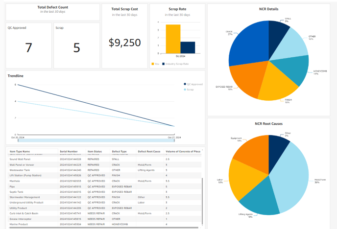
Top Left: Total Defect Count
This shows how many of your items have been repaired and approved by QC and the number that have been Scrapped. These numbers will reflect the latest 30 days of data.
Top Center Left: Total Scrap Cost
This number is calculated based on the total volume of concrete of each item marked as Scrap multiplied by a value of $500. This is Idencia’s rough cost per unit of concrete volume of a scrapped item. These numbers will reflect the latest 30 days of data.
Top Center Right: Scrap Rate vs Industry
These bars will show you your Scrap Rate vs the industry average Scrap Rate of a NPCA plant over the most recent 30-day period. You can use this to compare how you stack up to other NPCA producers.
Top Right: Defect Details
Here we provide you with a pie chart of what kinds of defects you most commonly have. This will help you focus your strategy on preventing the largest categories of defects to minimize repairs needed.
Left Center: Trendline of Scrap and Repairs over the Contest Duration
This trendline will show you how you have been improving over time. The more negative your trend, the more you are improving your scrap and repair rates! If the line trends upward, take some time to look at the causes of your defects to see what might be causing an increase in pieces needing repair or scrap.
Bottom Left: Table of all items recorded for scrap or repair
This simple table gives you a complete, detailed view of the kinds of products with defects, and what defects they most commonly have.
Bottom Right: Defect Root Causes
See what your most frequent defect causes are by category. This will help you to address issues at the start to have an improved outcome for your plant. Saving money along the way.
Watch the video below for a step-by-step walk-through.