![Idencia-Logos-White-2023.svg]](https://knowledge.idencia.com/hubfs/Idencia-Logos-White-2023.svg)
Applicable Subscription Levels:
QC MANAGER | STARTER | PRO | PRO+ | ENTERPRISE
Overview
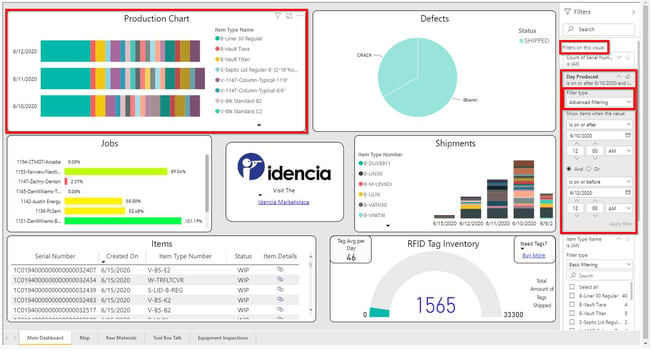
Your Idencia Dashboard presents an instant, intelligent, graphical view of data in your Idencia system. Leveraging Microsoft Power BI data visualization tools, the dashboard provides business intelligence in an easily digestible format so that members of your organization can make confident, data driven decisions.
This article will discuss:
Dashboard Refresh Schedule
Visualizations at a Glance
Standard Dashboard Visualizations
Optional Dashboard Visualizations
Custom Dashboard Visualizations
Drilling In
Using the Filter Pane
Show or Hide the Filters Pane
Page Filters
Visual Specific Filters
Search within a Filter
Clear a Filter
Filter Types
Viewing Applied Filters
Using Cross Filtering in Combination with the Filter Pane
Dashboard Refresh Schedule
While it is not possible to know exactly when your dashboard will refresh, each dashboard will refresh at least once per hour. Dashboard data will be at most, 1 hour old.
Visualizations at a Glance
Standard Dashboard Visualizations
Each Dashboard will include six or seven standard visualizations out of the box:
-
Daily Production Chart
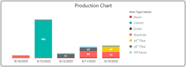
A bar chart displaying the count of items produced each day. This chart provides a visual representation of how your production runs vary over time. By default, the Production Chart groups items by item type, but can be customized to group by status, customer, job, or any other relevant data point.
Drill down functionality is available by clicking a section of the bar chart or an item in the legend. -
Job Status Chart
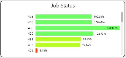
A bar chart displaying the production progress of each active job in your Idencia system. Production progress is measured as a percent of the required items produced.
Drill down functionality is available by clicking a bar in the chart.
Prerequisite: This visualization requires the use of Jobs. -
Recent Items List
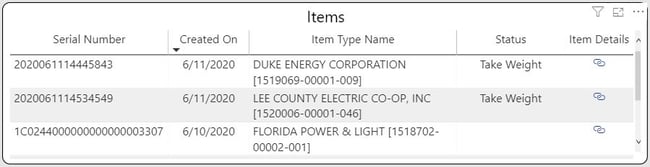
A list of the most recent items created in your Idencia system. The item list is ordered by creation date and includes a link to each item's Item Details page. By default, the Item List includes the Serial Number, Created Date, Item Type Name, Item Status, and Item Details Link. These columns can be customized to include the custom properties of your choice.
Clicking the Item Details link will open the Item Details page for the relevant serial number. -
Non-Conformance Report (NCR) Chart
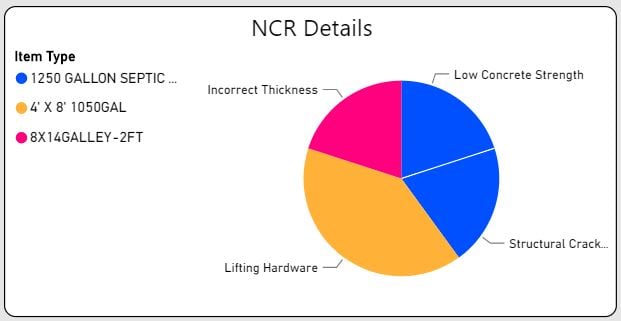
A pie chart displaying the open NCRs in your Idencia system. Information displayed includes each NCR number along with the type of non-conformance. This visual can be customized to work with your non-conformance, defect, or repair process, can use your nomenclature, and can include data points relevant to your business process.
Drill down functionality is available by clicking a section of the pie chart or an item in the legend.
Prerequisite: This visualization requires a Non-conformance or Repair process and appropriate statuses. -
Daily Shipments Chart
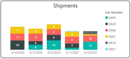
A bar chart displaying the count of items shipped each day. By default, this visual groups and color codes items by job, but can be customized to group by Item Type or other relevant data point.
Drill down functionality is available by clicking a section of the bar chart or an item in the legend.
Prerequisite: This visualization requires the use of Job Shipments and/or a shipping process with appropriate statuses -
RFID Tag Inventory Chart
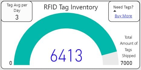
A gauge chart displaying the approximate number of RFID tags you should have in inventory and the average number of tags being consumed each day. Also included is a quick access link to the Idencia shop that makes ordering tags a breeze.
Clicking the Buy More link will open the Idencia Shop where additional tags can be purchased.
Prerequisite: This visualization requires the use of RFID tags purchased from Idencia. -
GPS location inventory map
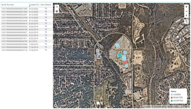
A scatter chart and accompanying item list detailing the GPS coordinates of each item in your inventory. The chart is displayed over a Google Maps image encompassing the item coordinates and Zoom in/out functionality is provided. By default, this chart color codes each item by status, but can be customized to color code by Item Type, Job, or Customer.
Clicking a serial number in the list will remove all other pins from the map except the selected item, allowing you to quickly and easily locate an individual item in your yard. Clicking the Item Details link will open the Item Details page for the selected serial number.
Prerequisite: This visualization requires the capturing/entering of GPS coordinates for each item in inventory.
Optional Dashboard Visualizations
Optional visualizations require very specific processes to be in place before they can be applied. If your organization does not use these processes, and does not plan to implement them in Idencia, tabs for the optional visualizations can be hidden upon request.
Optional visualizations include:
-
Raw Material Tracking
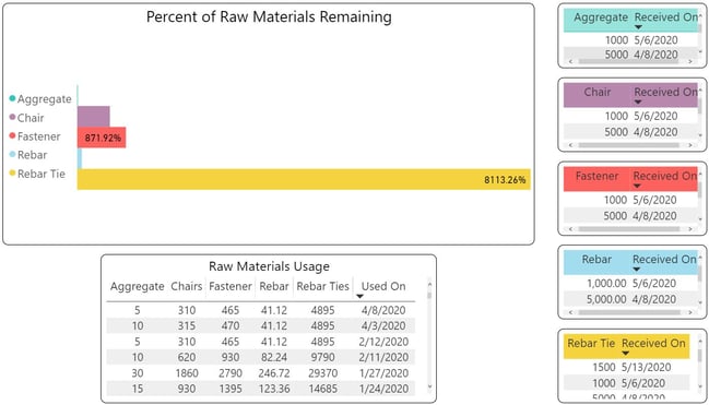
A bar graph and accompanying lists that provide an overview of the raw material quantities you should have in inventory and the quantities delivered and used over time.
Drill down functionality is available by clicking a bar in the chart or any list item.
Prerequisite: This visualization requires the use of a Raw Materials Tracking process. -
Tool Box Talks (a.k.a. safety meetings)
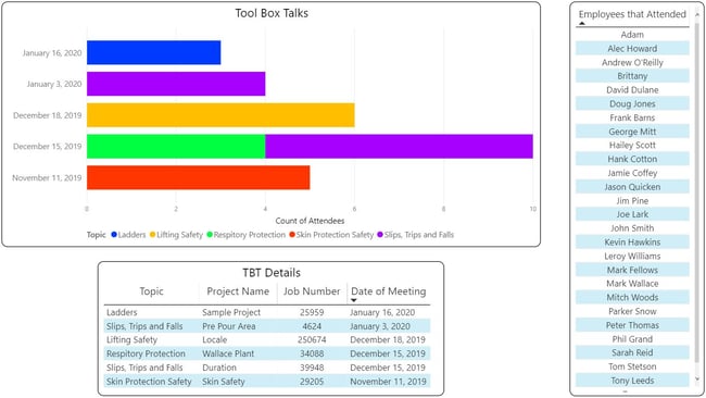
A bar graph and accompanying lists that provide an overview of recent safety meetings, the topics that were discussed, and the employees who attended.
Drill down functionality is available by clicking a section of the bar chart or an item in the accompanying lists.
Prerequisite: This visualization requires the use of a Tool Box Talk (or safety meeting) process. -
Equipment Inspections
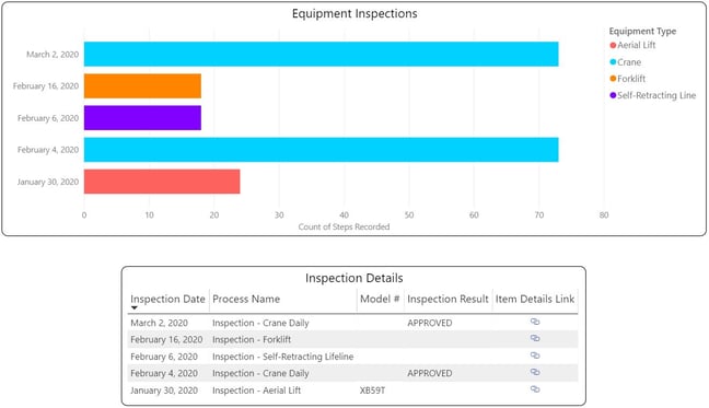
A bar chart and accompanying list highlighting recent equipment inspections and inspection results. Clicking the Item Details link will open the Item Details page for the serialized piece of equipment.
Drill down functionality is available by clicking a section of the bar chart or an item in the list.
Prerequisite: This visualization requires the serialization of equipment and the use of an Equipment Inspections process.
Custom Dashboard Visualizations
Custom visualizations specific to your data and business process can also be created. Any data set that can be displayed in a chart, graph, or list can be output to a visualization on your dashboard. Talk to your Customer Liaison or use the Support Button to request more information.
Drilling In
Visualizations help you monitor data and drill down into issues in order to identify patterns and find problems that may need attention. Each visual presented in the Dashboard will have some drill down functionality or links to other areas of the application where more information can be found.
Cross Filtering
In some cases, drilling in on one visual will result in "cross filtering" on other visuals.
Cross Filtering Example: Clicking on an item in the Production Chart, filters data in the other visuals. The Jobs visual filters to display the Job to which the selected item belongs, the Items visual filters so that only the selected serial number is displayed, etc. Clicking again anywhere in the Production visual will remove the filter.
Using the Filter Pane
To the right of your dashboard is the filter pane. The filter pane contains filters that are relevant to the data in your dashboard. 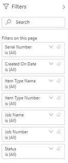
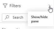
Show or Hide the Filters Pane
The filters pane can be shown or hidden by clicking the Show/Hide Pane button.
Page Filters
Note that when you first open the Dashboard, before you have clicked on a specific visual, there is one set of filters available under the heading Filters on this Page.
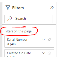
These filters are relevant to most, if not all of the visuals on the page. When one of these filters is used, all of the visuals on the page will be updated to reflect the selected filter.
Visual Specific Filters
Once you have clicked on a visual, any additional filters specific to that visual will be displayed in the Filters pane.
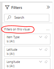
Visual specific filters work just like page filters, but affect only that visual.
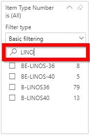
Search within a Filter
Until you have selected a filter to limit the data being returned, all relevant data is included. You can see that each of the filters have (All) next to them. This means that all values are being included. In the screen shot above, Item Type Number is (All) tells us that the visualizations on the page contain information about all relevant Item Type Numbers in your database.
To use a filter, click the down arrow next to the filter name. This will expand the filter and display the available options. Sometimes, a filter can have a long list of values. Use the search box to find the value you want.
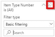
Clear a Filter
To reset a filter to (All), clear it by selecting the eraser icon next to the filter name.
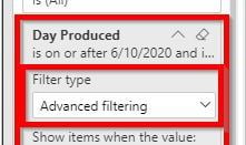
Filter Types
Depending on the type of data that is being filtered, filter options will range from simple selections in a list to identifying ranges of dates or numbers.
In this example, the Production Chart visual is using advanced filtering to apply "is on or after" and "is on or before" filters for a specific date range. Notice that only the Production Chart visual has been filtered to this date range.
To see the filter options, click the drop down list under the Filter Type heading. The example above uses the "Advanced filtering" option.
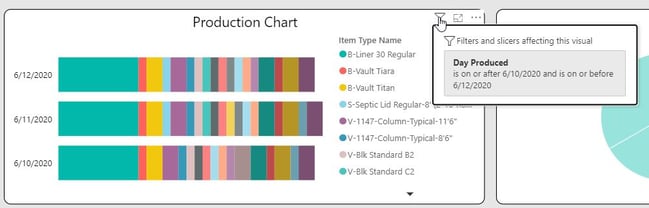
Viewing Applied Filters
To see what filters are affecting a specific visual without having to open and browse the Filters pane, hover over the visual and select the filter icon that appears in the upper right corner. Clicking the filter icon (![]() )on a visual will display all of the filters applied to that visual, whether applied at the page level or the visual level.
)on a visual will display all of the filters applied to that visual, whether applied at the page level or the visual level.
Using Cross Filtering in Combination with the Filter Pane
As we saw above, cross filtering can be useful to identify how one value in your data contributes to another. In the video example, selecting an item in the Production Chart cross filtered the Jobs visual to bring only the Job related to the selected product into focus.
Note that visual-level filters are retained when cross filtering other visuals on the page.
For example, if the Production Chart visual has the Day Produced filter applied (as shown above), and you click on a product in the Production Chart visual, this will cause both the visual-level filters from the Production Chart to be applied to each of the other Visuals.